Wednesday 29 November 2017

A Rubbish Thinking Professional = Rubbish Advertising = An Utter Waste of Money


And so the 'creative advertising merry-go-round madness', continues.  

Take a look at the above.

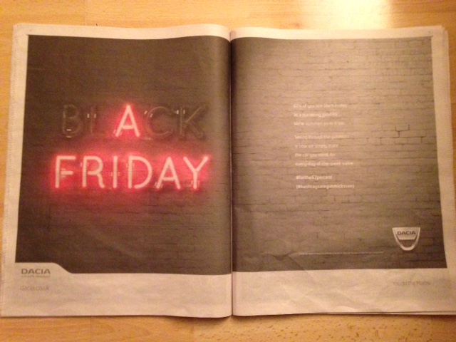
The headline of course, is utter rubbish. The message it's trying to convey, is nonsensical. 

Next, why pay for a full page ad, if you're only using half the page?

Next, why have the copy outlined in the format of some shimmy hoola boola dancers? 

And then, why have the copy be made hard to read with light blue writing on a paler blue background?

Ads are meant to stand out and gain attention. But not in this nincompoop way.

In fact, there's some insightful copy in the piece, though it's poorly presented in the way it appears above. 

So what would make this ad stand out? (And therefore, get greater readership and potential investors?)

How about dropping the copy into a formatted version of the David Ogilvy ad - "At 60 Miles An Hour, The Loudest Noise In This New Rolls Royce Comes From The Electric Clock"    


There's no reason to have shoddy advertising represent good quality products and services. 

Yet it seems to be happening everyday when you flip open a magazine, newspaper or search the Internet.

And what's all the more worrying is this kind of shoddy lazy application is being produced by 'professionals' who have probably attended some kind of university or place of higher learning. 

Oh dear.    

So what if you're reading this and you have to create ads to sell your products or services - why not challenge yourself or your people to create the most inviting, engaging, curiosity provoking ads they can create?  

Why not challenge them to produce a 10X  better ad than what they first come up with?

There's nothing inspiring about creating mediocre or less than mediocre output. Not only is it damaging to a business, it's a complete waste of money - CLIENT money. 

If you want a fresh pair of qualified eyes help you create the kind of advertising that creates monetary results and riveted attention from your audience, then here's the place to go: raja.hireker@gmail.com 


Friday 24 November 2017

BLACK FRIDAY STUPIDITY AD for DACIA CARS


Let's talk about this ad.

And, why it's a monumental waste of space, money, intelligence, potential customer inquiries.

Let's take the shiny neon writing - A FRIDAY --

WHAT does that actually signify, mean, communicate?

I have zero idea.

A cute riddle probably - the answer to which only the souls who created it, know.  

Let's read the COPY on the right hand page - which is white, on a grey background (They're deciding that making their copy difficult to read is the best way to have their message not be read. Which isn't a bad idea when you get to get to read the heart of their message!)

67% of you see Black Friday
as a marketing gimmick:
We're switched on to it too.

Seeing through the gimmicks
is how we simply make 
the car you need, for
every-day-of-the-week value.

So that's it. 

That's the compelling copy created by marketing professionals that'll supposedly make you want to be connected with Dacia in some way.  

And there's a little line near the foot of the page to say:

2,000 UK adults surveyed by One Poll on behalf of Dacia UK between 27/10/2017 and 01/11/2017

And below that, in the bottom right hand corner you'll see the following 

You do the Maths.

Hmmm......

So the first point is if you're going to spend money on a full page ad to say that you're not falling for marketing gimmicks, then why not use the page to make an irresistible Non Black Friday Offer? 

Why not demonstrate what exactly this 'every-day-of-the-week value, is? 

Why not use all that valuable real estate on the page to communicate what Dacia cars are all about, and how the readers can get a hold of more information, get details about a test drive, get details about a small replica Dacia they can keep (or some other gift), what their surveyed people would be doing instead of buying a Black Friday deal.  

In other words...

Why not make the advertisement a valuable piece, just by itself -- something compelling and irresistible that'd have people want to tear the page out, keep it, refer to it... 

-- rather than have them look at the ad and wonder what the hell it's all about, and quickly turn over to the next page of the newspaper.    

And the facts are that EVEN if Black Friday is a gimmick according to Dacia's ad agency , there'll be more trade done online during this period than offline. (Black Friday has kicked off what is predicted to be the biggest ever weekend of shopping in the UK - with consumers set to spend almost £8 billion. Evening Standard 24.11.2017)

The poor souls representing Dacia have miscalculated in that people WILL buy on Black Friday, no matter if their small biased 2000 selection of people aren't being taken in by the 'gimmick'.

They've NOT done their maths. 

What's worse, is they've spent money advertising the fact they're not into making Black Friday deals, and yet, have done an extremely poor job in communicating even that very message!  

Think about that if you have the ultimate responsibility for profits and bottom lime results - the ad cost is the same, it's the same fixed cost no matter WHAT you put on the page. Yet, the WHAT you put on the page is the difference that can yield very differing results. 

Sometimes... up to 21 times difference!

Like I say, think about the leverage in that.  

  ------

MY COMMERCIAL TO YOU: Don't have your quality based products and services represented and communicated to the marketplace by sloppy thinking souls. Challenge your ads and communications to have that irresistible appeal and that pays its way. You can find out more - www.RajaHireker.com
http://www.rajahireker.com/whythehell.pdf      


Wednesday 22 November 2017

Pure waste of Client (Natwest Bank) Money - Thanks to Nitwit, Sloth Like Thinking

What's wrong with this Ad?

What's wrong is that what's being sold here is the creative non-artistry and copywriting incompetence of those who'll obviously not put their names to the above.

And why won't they put their names to it?

Because it's not their money on the line. It's the client money on the line.

And so because of that, that little wrinkle seems to give license for the agency to release such award winning nonsense.

Let's dissect:

Why would you show the sole of a shoe as the main image when promoting Premier Banking?

And, why show a tip of another shoe?

What's the use of it?

What message is it intended to send?

Who is the main audience for the service, and does the shoe image add to the impact?

What audience does the shoe, alienate?

What's the reason for all that wasted grey space on the page?

The copy on the sole of the shoe says:

"For those who want to see their bank manager without actually visit the bank" 

Now is that not a better, attention grabbing headline than the weak and lame - Introducing Premier Banking from NatWest? 

Here's their compelling reasoning for why their Premier Banking is different - because our customers are different! 

Is that kind of advertising premier? Does that kind of reasoning distinguish their clientele?

How about we fix things?

HEADLINE:

7 Reasons NatWest's New Premier Banking Service is Just What You've Been Looking For 

IMAGES: 

Several: to reflect the specific type of customer, the amount of money needed to invest, images to reflect the reasons mentioned in the headline.

The LOOK

Editorial / advertorial style. More readership and attention is gained through a non looking ad. It adds a premier type feel.

CTA

Have readers respond to a particular website or number in order to pick up a special report, guide, set of instructions that's written in conversational, plain simple English with a specific 'intro offer' for new clients to avail themselves of.

NatWest have incorporated this slogan into their advertising - We Are What We Do

Sadly, what they've done is they've done stupid by letting creative dimwits take over the show.

When in fact...

Simple ideas executed well, saves money, saves face and helps the customer get the end results the product or service is designed to do for them.